
People are just jumping into the pol of responsiveness, well they need their website to be responsive so that it can get maximum response from people who are continuously changing their gadgets to browse Internet. Well recently I posted about the online tools popping up providing you the possibility to convert your online media into responsive design, so that you people with less knowledge can obviously make more out of it. But today we are talking about making our AdSense ad units into responsive ad units so that people on different gadgets can always view your website and advertisements more accurately.
Earlier also people have already experimented on this thing and obviously they have created responsive ad designs but now we are talking about official update from Google which is much more stable and legal to be applied, yes now you do not worry about manipulating the code unless its under terms.
Official Responsive AdSense Ad Units
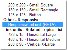
So now this ad unit is till in BETA testing more but it will like a charm. Now this code is already Asynchronous Loading enabled so you will not see that two code choosing option. Now as you choose the code you will get your code somewhat like below including some default @media tags for responsive CSS structure, but will need to manipulate these codes according to your website's requirement.
<style>
.hu-responsive-ad { width: 320px; height: 50px; }
@media(min-width: 500px) { .hu-responsive-ad { width: 468px; height: 60px; } }
@media(min-width: 800px) { .hu-responsive-ad { width: 728px; height: 90px; } }
</style>
<script async src="http://pagead2.googlesyndication.com/pagead/js/adsbygoogle.js"></script>
<!-- HU Responsive Ad -->
<ins class="adsbygoogle hu-responsive-ad"
style="display:inline-block"
data-ad-client="ca-pub-127398712987372"
data-ad-slot="1283712933"></ins>
<script>
(adsbygoogle = window.adsbygoogle || []).push({});
</script>
So now you can add this code to wherever you want responsive ad design but make sure you you customize the @media tags according to your website, else it won’t work. So now possible it’s a big step by AdSense team bringing more and more option for their loyal publisher to gain income, well now its your time to coop up with them & apply it. For further information and documentation you can read it here [Link]
(COMMENTS WILL LOAD AUTOMATICALLY)